Before
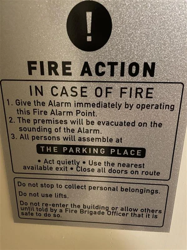
At a hotel in a Greek-speaking country, the fire safety instructions were clear in meaning, but the English translation wasn’t quite accurate. While it was easy to understand the general message, a properly translated version would make it clearer and more professional for international guests.
After
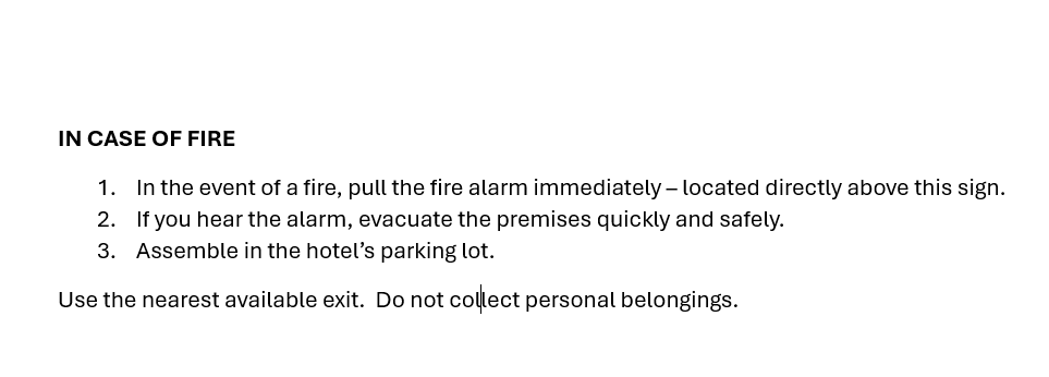
We created a corrected mock-up of the fire safety sign with proper spelling and grammar to share with the hotel. While on site, we coordinated with a local contractor to produce new signage in English, French, and Greek — ensuring clarity and consistency for all guests.
Before

This was on a website that was translated from Spanish to English. While the guest understands the message, the corrected version appears more professional.
After

We edited the website to ensure the English translation was done with correct spelling and grammar.
Before
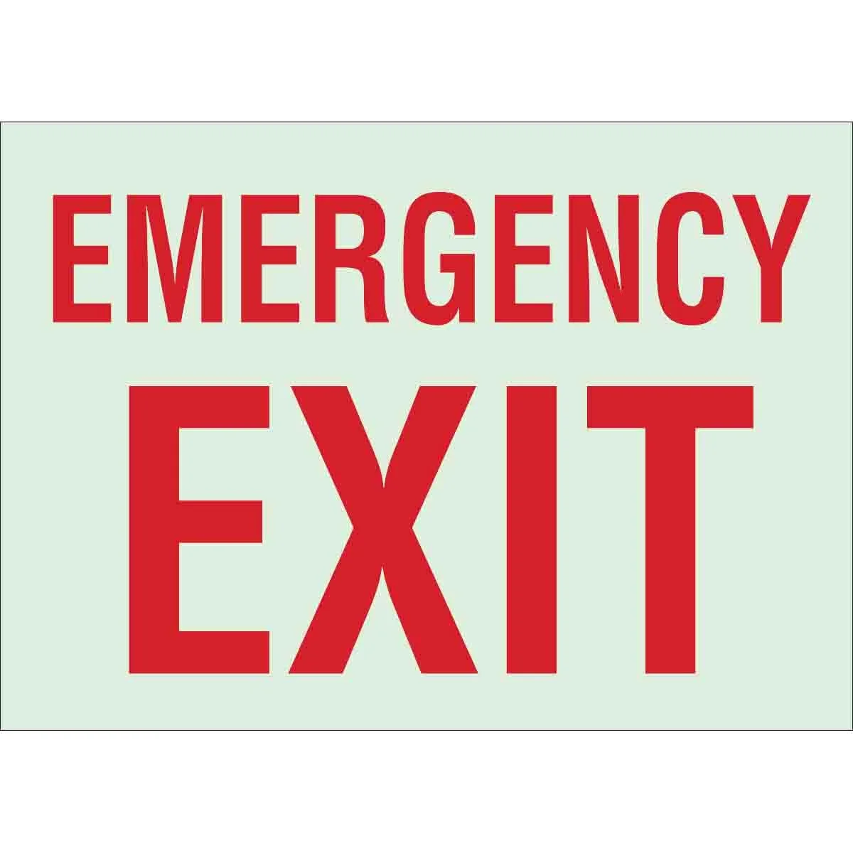
At a large outdoor event, the only signage for leaving the venue was a small sign labeled “Emergency Exit.” Some guests asked staff if they could use this exit, but most assumed it was only for emergencies, so they walked back to the original entrance to try find the exit— only to be directed to use the emergency-labeled exit. This caused confusion, long walks, and frustrated guests.
After

For the next event, we introduced clear, friendly “Exit” signage and markers that made the exit unmistakable. Staff received zero questions about where to leave, and guests moved smoothly through the designated exit — ending their experience on a positive note.
Before

At a resort, directional arrows were placed to guide guests to different activity areas, but the signage wasn’t specific enough. A sign pointing to “Blue Beach➡️” stood at a three-path intersection — leaving guests unsure which path the arrow referred to. Many stopped to ask staff for clarification or chose the wrong route, causing delays and frustration.
After
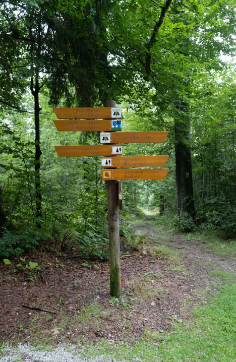
We redesigned the sign to remove guesswork. Clear, location-specific signs were placed at decision points, using labels, path markers, and visual cues to show exactly which route to take. Guests navigated confidently without needing to ask for help, improving flow and reducing congestion.
Before

The menu listed the items, but there were no allergy awareness icons or ingredient list to provide enough details for guests to determine if their dietary needs would be met.
After
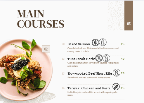
The menu items remained the same, but we amended the menu to include allergen specific symbols so that guests could make an informed decision.
For some restaurants we also created a specialty menu for specific allergens.
Before
The buffet had signs for each food item, but didn’t include allergy icons or ingredients so the guests were not able to determine if it contained any of their allergens.
After
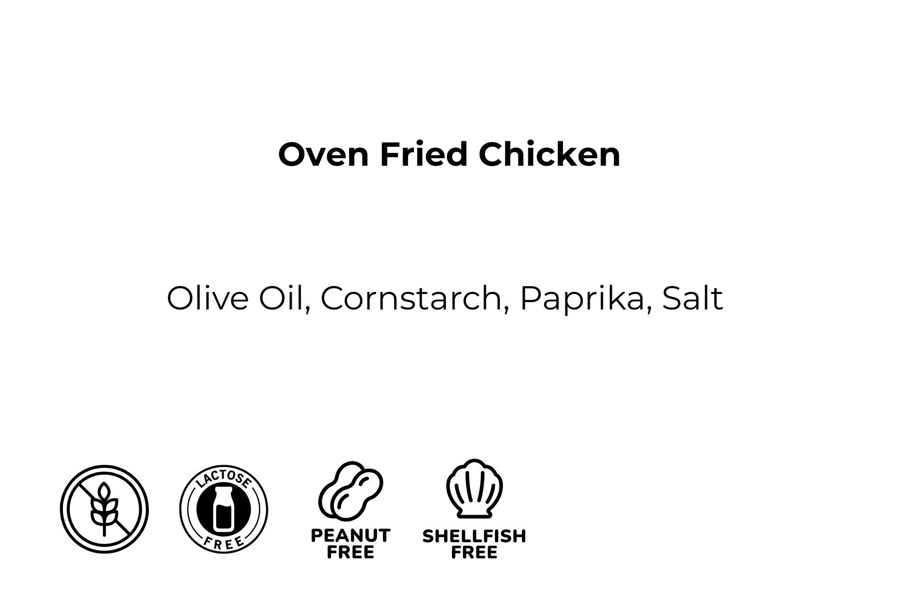
The buffet sign was changed to include not only the food item, but listed the ingredients and symbols of common allergens.

